When people think of McDonald’s, one image almost instantly comes to mind: the bright golden “M” arches rising above a roadside restaurant. The golden arches are one of the most recognizable corporate symbols in the world, associated with consistency, familiarity, and global reach.
But in one place in the United States, those iconic arches are not gold at all.
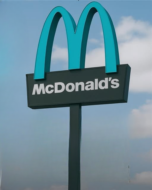
In the scenic desert town of Sedona, a local McDonald’s stands out for a very different reason: its arches are turquoise.
At first glance, the change might seem small. After all, it’s still unmistakably McDonald’s. The shape of the arches remains the same. The menu is familiar. The brand identity is intact. Yet the color difference tells a much larger story—one about community values, environmental sensitivity, architectural harmony, and the balance between global branding and local character.
So why are the arches turquoise in Sedona? And what does this unique decision reveal about how corporations and communities can work together?
Let’s explore the fascinating story behind one of the most distinctive fast-food locations in the country.
The Setting: Sedona’s Natural Beauty
To understand why the arches changed color, it helps to understand Sedona itself.
Located in northern Arizona, Sedona is famous for its dramatic red rock formations, desert landscapes, and expansive blue skies. Towering sandstone buttes and cliffs surround the town, creating a striking contrast of deep reds and earthy browns against bright Southwestern light.
Sedona is more than just visually impressive—it’s a community deeply invested in preserving its natural environment. Strict building codes and architectural guidelines help maintain the town’s aesthetic harmony. Bright, out-of-place commercial structures are generally discouraged in favor of designs that blend into the landscape.
In such a visually distinctive setting, every building becomes part of the overall canvas.
When plans emerged in the early 1990s for a new McDonald’s location, community members and city officials faced an important question: could the brand’s signature bright yellow arches coexist with Sedona’s iconic scenery?
A Branding Challenge Meets Local Values
The golden arches are central to McDonald’s identity. Across continents and cultures, the bold yellow “M” is a universal symbol.
However, in Sedona, there were concerns that the traditional bright gold might visually clash with the red rock surroundings. Residents worried that a highly saturated commercial sign could stand out too sharply against the natural desert tones.
City leaders and company representatives entered into discussions about how to proceed. The goal was not to prevent development, but to ensure that any new construction respected Sedona’s visual standards.
The solution? Keep the recognizable shape of the arches—but adjust the color to better complement the landscape.
Why Turquoise?
The chosen color was turquoise, a shade that carries both aesthetic and cultural resonance in the American Southwest.
Turquoise blends harmoniously with:
-
The reddish hues of Sedona’s sandstone formations
-
The wide desert sky
-
The region’s traditional architectural palette
Beyond visual compatibility, turquoise also holds cultural significance in Southwestern history and Native American art traditions. The color has long been associated with balance, protection, and natural beauty in the region.
By selecting turquoise instead of gold, the design preserved the familiar arch shape while softening its visual impact. The arches remained distinct—but not disruptive.
It was a compromise that honored both brand recognition and local identity.
Corporate Flexibility in Action
From a business perspective, modifying such a recognizable design element was no small decision.
The golden arches are among the most valuable brand assets in the world. Consistency across locations reinforces customer familiarity. Changing the color—even in a single location—could be seen as risky.
However, McDonald’s recognized that community acceptance was equally important. Demonstrating flexibility signaled respect for local values and a willingness to collaborate.
Rather than insisting on uniformity, the company chose adaptation.
The arches in Sedona still look like McDonald’s arches. The structure, proportions, and layout remain the same. Only the color changed.
This thoughtful adjustment allowed the restaurant to maintain its global identity while becoming a respectful part of its specific environment.
The Community’s Response
When the turquoise arches debuted in 1993, they quickly became a point of conversation.
Local residents appreciated the effort to preserve Sedona’s character. The restaurant’s design showed that commercial development did not have to overpower natural beauty.
Over time, the turquoise arches became something of a local landmark.
Visitors who traveled to Sedona to see its red rocks and hiking trails often stopped to photograph the uniquely colored McDonald’s sign. What began as a compromise became a distinctive feature of the town’s landscape.
In many ways, the change strengthened goodwill between the company and the community.
A Case Study in Adaptive Branding
The Sedona location is often cited as an example of adaptive branding—where a global corporation tailors elements of its visual identity to fit a local context.
This approach acknowledges an important truth: communities are not interchangeable.
What works visually in a bustling urban center may not work in a scenic desert town. Respecting local guidelines fosters trust and cooperation.
The turquoise arches demonstrate that brand strength does not necessarily depend on rigid uniformity. Sometimes, thoughtful variation can enhance a brand’s reputation rather than weaken it.
Architectural Harmony and Urban Planning
Sedona’s building codes aim to preserve unobstructed views and minimize visual intrusion. Many commercial buildings in the area feature muted earth tones and natural materials.
In this context, the decision to modify the arches fits into a broader philosophy of architectural harmony.
Urban planning often involves balancing economic growth with environmental preservation. Allowing businesses to operate while maintaining scenic integrity requires compromise and creativity.
The Sedona McDonald’s shows how even major corporations can adapt to local planning standards without sacrificing their core identity.
Tourism and the Power of a Small Difference
Interestingly, the turquoise arches have become something of a tourist attraction in their own right.
Travelers often share photos of the uniquely colored sign, highlighting it as a quirky detail of their visit. In a town known for natural landmarks, the restaurant has carved out its own modest place in the narrative.
While Sedona’s red rock formations remain the main draw, the turquoise arches add an unexpected element of charm.
It’s a reminder that small design decisions can have outsized cultural impact.
Corporate Responsibility and Community Engagement
The early 1990s marked a period when corporations were increasingly scrutinized for their environmental and social impact. Companies began paying closer attention to corporate responsibility initiatives and community engagement strategies.
By agreeing to adjust the arches, McDonald’s demonstrated responsiveness rather than resistance.
This approach reinforced the idea that successful businesses do not operate in isolation. They exist within communities—and those communities have values worth respecting.
The Sedona example illustrates how dialogue between local government and corporate leadership can produce creative solutions.
Have Other Locations Followed Suit?
The turquoise arches in Sedona remain unique in the United States. While other McDonald’s locations may adapt architectural styles to fit historic districts or local design standards, none have become as widely known for a color change.
However, the Sedona case set a precedent.
It showed that flexibility is possible. It demonstrated that branding can coexist with environmental mindfulness.
In other parts of the world, companies across industries have since adapted signage, materials, and exterior design elements to align with local culture or regulations.
The Balance Between Identity and Integration
At its core, the turquoise arches story is about balance.
On one side stands a global brand with decades of established recognition. On the other stands a small town committed to preserving its unique natural setting.
Rather than competing, these forces collaborated.
The result was not a diluted brand or a compromised landscape—but a thoughtful integration of both.
The arches still signal familiarity. The restaurant still serves its standard menu. Yet the color shift communicates respect.
Lessons for Businesses Everywhere
There are several key takeaways from the Sedona McDonald’s story:
1. Listen to Local Voices
Community input can guide successful adaptation.
2. Preserve Core Identity While Allowing Flexibility
Small adjustments can protect both brand recognition and local character.
3. Environmental Sensitivity Matters
Respecting natural surroundings builds long-term goodwill.
4. Innovation Doesn’t Always Mean Expansion
Sometimes innovation means refinement.
A Symbol That Tells a Bigger Story
Today, the turquoise arches stand quietly against Sedona’s red rock backdrop. They are not flashy or attention-seeking. They simply exist as part of the landscape.
Yet they represent a powerful example of cooperation.
In a world where commercial development often sparks controversy, the Sedona McDonald’s shows that compromise and creativity can lead to positive outcomes.
The color turquoise may seem like a minor detail—but in context, it reflects thoughtful planning and mutual respect.
Conclusion: A Small Change with Lasting Meaning
If you ever visit Sedona, you may find yourself driving past a McDonald’s with turquoise arches. At first, you might do a double take.
But behind that color change lies a story of collaboration between a global company and a small community determined to protect its natural beauty.
The arches remain instantly recognizable. The experience inside is familiar. Yet the exterior design reflects something unique about its surroundings.
In the end, the turquoise arches are more than just a visual curiosity. They are a reminder that even the most established brands can adapt thoughtfully—and that sometimes, the smallest design decisions can carry the greatest meaning.