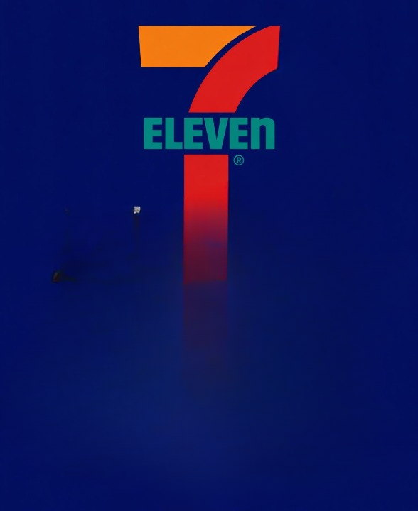
Most people recognize the 7-Eleven logo instantly. The bold number “7,” bright colors, and familiar design have become a worldwide symbol of convenience stores and quick shopping stops. But many people eventually notice one unusual detail hidden in plain sight: in the word “Eleven,” the final “n” is lowercase while the rest of the letters are uppercase.
It’s a tiny design choice, yet it has sparked curiosity for years. Was it intentional? Does it have a secret meaning? Or was it simply a design accident?
The real story behind the 7-Eleven logo is surprisingly interesting because it reflects not only the company’s branding strategy but also how small design details can influence the way people emotionally connect with a business.
The Origins of 7-Eleven
The history of 7-Eleven began long before the modern convenience store industry existed.
In 1927, the business started in Dallas, Texas, under the name “Tote’m Stores.” At the time, the concept was considered innovative because customers could purchase multiple everyday items in one convenient location instead of visiting several separate stores.
The stores focused on practical essentials such as:
- Milk
- Bread
- Eggs
- Groceries
- Household basics
The idea of convenience shopping may seem ordinary today, but during that era, it represented a major shift in retail culture.
The original name “Tote’m” came from the idea that shoppers could “tote” or carry their purchases home easily.
The Birth of the 7-Eleven Name
In 1946, the company introduced a major rebranding effort and officially changed its name to “7-Eleven.”
The new name reflected the store’s operating hours:
- Open from 7 a.m.
- Until 11 p.m.
At the time, those extended hours were unusual. Many businesses closed much earlier in the evening, so staying open late became one of the company’s strongest selling points.
The name itself became part of the marketing strategy. It immediately communicated convenience, accessibility, and reliability to customers.
This branding decision helped establish the company as a modern solution for busy consumers.
Creating a Memorable Visual Identity
As the company expanded, it needed a logo that customers could recognize quickly and easily.
The resulting design featured:
- A large red number “7”
- The word “Eleven” beneath it
- Bright red, orange, and green color accents
These bold colors were chosen intentionally because they stood out from a distance and remained highly visible both during the day and at night.
For convenience stores located along roads, highways, and busy urban areas, strong visibility was extremely important. The logo needed to attract attention quickly, especially from passing drivers.
The simple yet striking design helped make the brand recognizable around the world.
Why the Logo Became So Successful
One reason the 7-Eleven logo has remained effective for decades is its consistency.
While many companies completely redesign their branding over time, 7-Eleven kept its core visual identity largely intact. Minor adjustments have occurred throughout the years, but the overall appearance remains instantly familiar.
Consistency in branding helps businesses:
- Build trust
- Improve recognition
- Strengthen customer memory
- Maintain a recognizable identity across locations
Whether someone visits a 7-Eleven in North America or Asia, the logo immediately signals familiarity and convenience.
The Mystery of the Lowercase “n”
The most discussed detail in the logo is the lowercase “n” at the end of “Eleven.”
Originally, the logo used all uppercase letters. However, company leaders reportedly felt the design looked too rigid and aggressive.
According to company history, the wife of former president Joe C. Thompson Jr. suggested changing the final “N” to lowercase in order to soften the logo’s appearance.
This simple modification created a friendlier and more approachable visual effect.
Rather than appearing harsh or overly formal, the updated logo felt:
- More welcoming
- More casual
- More human
- Easier on the eyes
The lowercase “n” became one of the brand’s most recognizable and unusual features.
A Small Design Choice with Big Impact
At first glance, changing a single letter may not seem important. However, branding experts often emphasize that subtle details can significantly influence how consumers perceive a company.
Visual design affects emotions more than many people realize.
For example:
- Rounded fonts often feel friendlier
- Sharp edges may feel more formal or aggressive
- Bright colors create energy and visibility
- Softer details create approachability
The lowercase “n” helped balance the boldness of the logo and made the overall design feel less intimidating.
Over time, this tiny adjustment became part of the company’s identity.
The Shift to 24-Hour Stores
Although the company name references operating hours of 7 a.m. to 11 p.m., many 7-Eleven locations today operate 24 hours a day.
The move toward all-night service began in the 1960s. One location in Austin, Texas, reportedly stayed open later than usual during a busy football weekend to meet customer demand.
The experiment proved successful, and more stores gradually adopted extended overnight hours.
Eventually, many locations became fully 24/7 operations.
Despite the change in schedule, the company kept the name “7-Eleven” because it had already become strongly associated with convenience and brand recognition.
Changing the name would have risked losing decades of customer familiarity.
Global Expansion of the Brand
Over time, 7-Eleven grew from a regional American business into one of the world’s largest convenience store chains.
Today, the brand operates in numerous countries and serves millions of customers daily.
The company became especially successful in parts of Asia, where convenience stores play an important role in everyday urban life.
Depending on the country, stores may offer:
- Snacks and beverages
- Fresh meals
- ATM services
- Bill payment options
- Package pickup services
- Coffee stations
- Household essentials
Despite regional differences, the familiar logo remains consistent around the world.
Why Logo Design Matters
The story of the 7-Eleven logo highlights the importance of branding in modern business.
A strong logo helps companies:
- Stand out from competitors
- Build customer trust
- Create emotional connection
- Improve memorability
- Communicate brand values quickly
Many of the world’s most recognizable brands use simple visual elements that remain consistent over decades.
In the case of 7-Eleven, the logo communicates:
- Convenience
- Accessibility
- Familiarity
- Simplicity
Even people who rarely think about logos subconsciously associate the design with quick service and everyday shopping.
How Small Details Influence Consumer Perception
The lowercase “n” demonstrates how tiny visual adjustments can shape public perception.
Consumers often respond emotionally to design choices without consciously realizing it.
A softer, friendlier logo may encourage:
- Greater comfort
- Positive emotional response
- Stronger brand loyalty
- Increased familiarity
The success of branding often depends on these subtle psychological effects.
What seems like a minor design decision can become an iconic characteristic remembered by millions of people.
A Lasting Symbol of Convenience
Today, the 7-Eleven logo represents much more than a retail business. It symbolizes convenience culture itself.
For decades, the company has built its identity around being available when customers need quick access to food, drinks, and everyday essentials.
The logo reflects that mission through:
- High visibility
- Simple design
- Consistent branding
- Friendly presentation
Its continued recognition shows the power of thoughtful branding and long-term consistency.
Final Thoughts
The story behind the 7-Eleven logo proves that even the smallest design choices can leave a lasting impression. What many people see as a simple lowercase “n” was actually a deliberate decision intended to make the brand appear more welcoming and approachable.
From its beginnings as Tote’m Stores in 1927 to its evolution into a global convenience store chain, 7-Eleven has built a recognizable identity rooted in accessibility and familiarity.
The logo’s colors, structure, and subtle details all contribute to its lasting success. Over the years, the lowercase “n” has become more than just a typographic choice—it has become part of one of the world’s most recognizable retail brands.
Sometimes, the details people notice least are the ones that make the strongest impact over time.