Logos are everywhere in modern life. From the signs we pass on busy streets to the products we pick up in stores, logos act as visual shortcuts that help us recognize brands instantly. Some logos are so familiar that we hardly notice them anymore—yet when we take a closer look, they often reveal interesting stories about design, history, and marketing decisions.
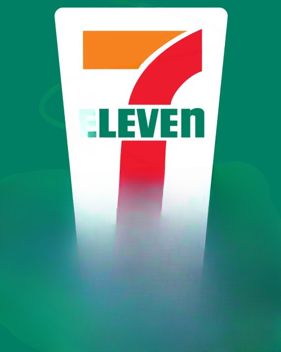
One example that many people see every day is the iconic red, orange, and green sign of 7-Eleven. Whether you stop by for a quick snack, a cup of coffee, or everyday essentials, chances are you have passed by this recognizable logo countless times. But if you observe it closely, you might notice something unusual. In the word “Eleven,” the final letter “n” is written in lowercase, while the rest of the letters are uppercase.
This small design detail often sparks curiosity. Why would a globally recognized brand choose to format its logo that way? Is there a hidden meaning behind it? Or was it simply a creative choice?
To understand the story behind the 7-Eleven logo, it helps to explore the company’s origins, its evolution over time, and how a simple design decision became a distinctive part of its identity.
The Origins of 7-Eleven
The story of 7-Eleven began nearly a century ago. In 1927, a small retail concept was launched in Dallas, Texas. At the time, the stores were not known as 7-Eleven. Instead, they operated under the name “Tote’m Stores.”
The name “Tote’m” reflected a simple idea: customers could “tote,” or carry, their groceries home. The stores offered basic everyday items such as milk, eggs, and bread. While this may sound ordinary today, it was actually a convenient concept at the time. Many people previously had to visit multiple shops to buy basic groceries, so having them available in one place was a practical improvement.
The business quickly gained popularity. Customers appreciated the convenience of quick shopping and reliable access to everyday necessities.
As the retail industry evolved, the company recognized the importance of adapting its brand to better represent its services.
The Meaning Behind the Name “7-Eleven”
In 1946, the company made an important decision: it changed its name from Tote’m Stores to 7-Eleven.
This new name was inspired by the store’s operating hours. At that time, most retail shops closed early in the evening. However, these convenience stores remained open from 7:00 in the morning until 11:00 at night.
Those extended hours were unusual for the era and became a major selling point for the business. The new name—7-Eleven—highlighted the store’s commitment to convenience and availability.
The idea was simple but powerful. When customers saw the name, they instantly understood that the store would likely be open when other shops were closed.
This branding decision helped differentiate the company from traditional retailers.
Creating a Recognizable Brand Identity
After adopting the new name, the company needed a strong visual identity that customers could easily recognize.
This is when the famous 7-Eleven logo was created.
The logo features several distinct elements:
- A large number “7”
- The word “Eleven” beneath it
- A bold color palette of red, orange, and green
Each of these design components contributes to the brand’s overall visibility.
The large number “7” immediately draws attention and connects directly to the company’s name. The word “Eleven” completes the brand identity in a clear and readable style.
Meanwhile, the bright color combination was chosen deliberately. Red and orange are energetic, eye-catching colors that stand out against typical urban environments. Green adds balance and freshness to the design.
Together, these colors create a sign that is easy to spot from a distance—an important feature for a convenience store where customers often make quick decisions about where to stop.
The Expansion of the Convenience Store Model
As the company continued to grow, its convenience store concept became increasingly successful. The idea of quick shopping and extended hours proved appealing to many customers.
Over time, the brand expanded beyond its original region and began opening locations in many parts of the United States.
Eventually, the company expanded internationally, bringing its convenience store model to multiple countries across Asia, Europe, and other regions.
The recognizable logo played a major role in this growth. Even in unfamiliar places, customers could easily identify the store thanks to its distinctive sign.
Consistency in branding helped create trust and familiarity.
The Shift Toward 24-Hour Service
Today, many people associate 7-Eleven with being open 24 hours a day. However, this was not always the case.
The move toward round-the-clock service began in the early 1960s. One widely shared story describes how a location in Austin, Texas decided to stay open overnight during a busy football weekend. Large numbers of customers were looking for late-night shopping options, and the store chose to keep serving them rather than closing at the usual time.
The experiment proved successful. Customers appreciated the ability to shop whenever they needed.
As a result, more locations began testing 24-hour operations.
Eventually, many stores adopted the model permanently. Being open all day and night became one of the brand’s defining features.
Interestingly, even after switching to 24-hour service, the company kept the name “7-Eleven.” By that point, the name had become a powerful brand identity, and changing it again would have been unnecessary.
The Curious Lowercase “n”
Now we return to the detail that many people notice: the lowercase “n” at the end of “Eleven.”
At first glance, it may seem like a small or even accidental design choice. But the story behind it has become part of the company’s lore.
Early versions of the logo displayed the word “ELEVEN” entirely in uppercase letters. While the design looked strong and bold, some people felt it appeared slightly harsh or overly formal.
According to a commonly shared explanation, the wife of a company executive suggested softening the design by changing the final letter to lowercase.
This small adjustment made the logo feel more friendly and approachable.
Instead of appearing rigid or strict, the brand now conveyed a welcoming tone that suited a neighborhood convenience store.
Whether or not this explanation is fully documented, the lowercase letter quickly became a permanent feature of the logo.
Why Small Design Details Matter
In branding, even tiny details can have a big impact.
Designers often experiment with typography, colors, spacing, and letter shapes to create logos that communicate a brand’s personality.
In the case of 7-Eleven, the lowercase “n” adds a subtle touch of uniqueness.
Once people notice it, they tend to remember it.
That small difference helps distinguish the logo from other retail signs.
It also adds a bit of visual character that keeps the design from feeling too rigid.
Consistency in Branding
One of the reasons the 7-Eleven logo has remained successful for decades is its consistency.
While the design has gone through minor refinements over the years, the overall structure has remained largely the same.
The large number 7, the bold colors, and the distinctive lettering have been preserved.
For a global company with thousands of locations, maintaining a consistent logo is extremely valuable.
Customers can quickly identify the store, whether they are in their hometown or traveling in another country.
This instant recognition helps strengthen brand loyalty and trust.
The Importance of Visual Recognition
Convenience stores rely heavily on quick visibility. Many customers make spontaneous decisions to stop by while driving or walking.
Because of this, the store’s sign needs to be recognizable from a distance and easy to understand in just a few seconds.
The bright color scheme and large number accomplish exactly that.
Even at night, illuminated signs help the store stand out along busy roads and city streets.
Over time, the logo has become one of the most recognizable retail symbols in the world.
The Global Reach of the Brand
Today, 7-Eleven operates thousands of stores across many countries.
While the products inside may vary depending on local preferences, the familiar logo remains largely the same.
This consistency helps travelers feel comfortable when visiting a location in another part of the world.
Seeing the same logo signals a familiar shopping experience.
It also reinforces the brand’s identity as a convenient place to find everyday items quickly.
How Logos Reflect Brand Personality
A well-designed logo does more than display a company’s name. It communicates personality and values.
For 7-Eleven, the design reflects ideas such as:
- Convenience
- Accessibility
- Simplicity
- Reliability
The bold number and bright colors capture attention, while the straightforward typography makes the brand easy to read.
The slightly softened lettering adds warmth and approachability.
Together, these elements create a design that feels practical yet welcoming.
Why the Logo Has Endured
Many brands update their logos frequently, sometimes dramatically. However, the 7-Eleven logo has remained relatively stable for decades.
This stability offers several advantages.
First, it protects the brand’s recognizability. When people see the sign, they instantly know what it represents.
Second, it preserves the company’s heritage. The design connects modern stores with the company’s long history.
Third, it avoids confusing customers. Drastic changes to a familiar logo can sometimes make a brand feel unfamiliar.
By keeping its core design intact, the company maintains a strong visual identity.
The Power of Everyday Branding
One reason the 7-Eleven logo is so widely recognized is simply because people encounter it often.
Convenience stores are located in busy neighborhoods, along highways, and near workplaces. Many people see the sign during daily routines.
Over time, repeated exposure makes the logo feel almost like part of the landscape.
Even people who rarely shop at the store can usually recognize the logo instantly.
This kind of everyday visibility is extremely valuable for a retail brand.
A Simple Design With a Memorable Story
When people first notice the lowercase “n” in the logo, they often wonder if it carries a hidden meaning.
In reality, the explanation appears to be far simpler.
The change likely reflected a desire to soften the logo’s appearance and make it feel more inviting.
Yet this small decision became a memorable detail that many customers notice and discuss.
It’s a good example of how subtle design choices can leave a lasting impression.
Final Thoughts
The story behind the 7-Eleven logo demonstrates how branding, history, and design often intersect.
What began as a small grocery concept in 1927 eventually grew into one of the world’s most recognizable convenience store chains. Along the way, the company adopted a name inspired by extended store hours and created a bold logo that customers could easily identify.
The colorful design, the prominent number 7, and the distinctive typography all contribute to the brand’s strong identity.
And that curious lowercase “n”? Rather than hiding a secret message, it simply reflects a thoughtful design adjustment that made the logo feel a bit more approachable.
Sometimes the smallest details can become the most memorable.
The next time you pass a 7-Eleven sign, you might notice the logo a little differently. Behind that familiar design lies nearly a century of history, innovation, and branding decisions that helped shape one of the most recognizable retail symbols in the world.