Brand logos often become so familiar that most people stop noticing the small details that make them unique. Millions of people around the world pass convenience stores every day without giving much thought to the design choices behind their signs. However, sometimes a tiny design detail sparks curiosity and leads to a deeper story about branding, history, and the evolution of a well-known company.
One example that frequently catches people’s attention is the logo of 7‑Eleven. The brand is recognized worldwide for its convenience stores, quick snacks, beverages, and extended operating hours. For many people, the colorful sign featuring the number “7” and the word “Eleven” is instantly recognizable.
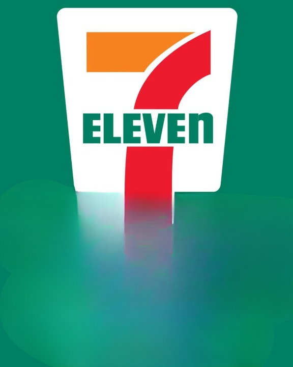
But there’s a small detail in the logo that many observers eventually notice: the final letter “n” in “Eleven” is lowercase, while the rest of the letters appear in uppercase. It may seem like a minor design choice, yet it has sparked curiosity among customers for years.
Why does the logo include that one lowercase letter? Was it intentional? Does it have a hidden meaning? And how did the brand develop the visual identity that has remained recognizable for decades?
To fully understand the answer, it helps to look at the history of the company, its early years, and the design decisions that helped shape one of the most recognizable retail brands in the world.
The Origins of the Company
The story of 7‑Eleven begins long before the brand adopted the name people know today.
The company’s roots trace back to 1927 in Dallas. At that time, the business operated under a completely different name: Tote’m Stores.
The concept behind Tote’m Stores was simple but innovative for its time. The name was inspired by the word “tote,” which means to carry something. The idea was that customers could conveniently carry—or “tote”—their groceries home after purchasing them from the store.
During the early 20th century, grocery shopping looked very different from what it does today. Many people had to visit several different stores to buy everyday necessities. One shop might sell bread, another might specialize in dairy products, and another might sell produce.
Tote’m Stores aimed to simplify that process by offering commonly used household items in one location. Customers could stop by and quickly pick up essentials such as:
-
Milk
-
Bread
-
Eggs
-
Basic pantry items
This approach made shopping faster and more convenient, which helped the business grow.
Although convenience stores are common today, the idea of a store focused on quick purchases and extended hours was relatively new at the time.
The Evolution of Convenience Retail
As the business expanded, the company gradually developed what would later become the modern convenience store model.
Instead of large supermarkets with long aisles and many departments, these smaller stores focused on providing quick access to everyday items.
Customers didn’t need to spend a long time shopping. Instead, they could stop in, purchase what they needed, and leave quickly.
This concept appealed to people with busy schedules or those who simply needed a few items without visiting a full grocery store.
Over time, the stores expanded their product offerings to include additional items such as:
-
Packaged snacks
-
Soft drinks
-
Candy and desserts
-
Tobacco products (in earlier decades)
-
Ready-to-eat foods
As the product selection grew, so did the popularity of the stores.
The Name Change That Defined the Brand
A major turning point came in 1946 when the company decided to adopt a new name.
The business was rebranded as 7‑Eleven.
This new name was not chosen randomly. Instead, it reflected a key feature that made the stores stand out at the time: their operating hours.
Many retail stores during the 1940s closed early in the evening. In contrast, these convenience stores remained open much later.
Their typical schedule was:
7 a.m. to 11 p.m.
At the time, those hours were considered extended service compared with most other retailers.
By naming the store “7-Eleven,” the company made its hours a central part of its identity. Customers could easily remember that the store would remain open later than many other places.
The name served as both branding and information. It told customers exactly what they could expect.
Creating a Memorable Logo
Once the company adopted the new name, it needed a clear visual identity to represent the brand.
This led to the creation of the now-famous logo.
The design includes several recognizable elements:
-
A large number 7
-
The word Eleven
-
A bold color palette
-
A compact, easy-to-read layout
Together, these elements created a logo that was easy to identify from a distance.
For a convenience store, this was extremely important. Many customers make quick decisions about where to stop while driving or walking through a neighborhood.
A strong logo helps customers recognize the store quickly.
The Meaning Behind the Colors
Another important aspect of the logo is its color scheme.
The familiar combination of red, orange, and green has become strongly associated with the brand.
These colors were likely chosen for several reasons:
Visibility
Bright colors are easier to notice from far away, especially on storefront signs.
Energy and warmth
Warm colors such as red and orange can create a sense of energy and excitement.
Balance
The green color provides contrast and balance to the warmer tones.
The combination makes the logo both vibrant and recognizable.
Even people who cannot immediately read the name may recognize the color pattern associated with the brand.
Global Recognition
As the company expanded internationally, maintaining a consistent logo became even more important.
Today, 7‑Eleven operates thousands of stores across multiple continents.
Whether someone visits a location in North America, Asia, or Europe, the familiar sign helps customers identify the store quickly.
Brand consistency plays a major role in building customer trust. When people recognize a logo, they often feel confident about what they will find inside the store.
For travelers, this recognition can be especially helpful. Seeing a familiar store sign in a different country can provide a sense of familiarity and convenience.
The Shift Toward 24-Hour Service
Today, many people associate convenience stores with round-the-clock service.
However, this was not always the case.
Originally, the stores operated only between 7 a.m. and 11 p.m., as reflected in the company’s name.
The transition toward 24-hour service reportedly began in the early 1960s.
One well-known story describes how a location in Austin remained open overnight during a particularly busy weekend involving local sporting events.
The store experienced a steady stream of customers who needed snacks, drinks, and other items late at night.
Instead of closing, the store continued serving customers.
The decision turned out to be successful.
As more locations experimented with extended hours, the concept of 24-hour convenience stores began to spread.
Eventually, many locations adopted around-the-clock service, making it possible for customers to shop at any time of day or night.
Why the Name Stayed the Same
Interestingly, even after many locations began operating 24 hours a day, the company kept the original name.
Changing a well-established brand name can be risky, especially when customers already recognize it.
By the time many stores switched to 24-hour service, the name 7‑Eleven had already become widely known.
Keeping the name allowed the company to maintain its identity while continuing to evolve its services.
This decision shows how powerful brand recognition can be.
The Curious Lowercase “n”
One of the most interesting details about the logo is the lowercase “n” at the end of the word “Eleven.”
When people first notice it, they often wonder if it has a hidden meaning.
Early versions of the logo actually used all capital letters.
The name appeared as:
7-ELEVEN
This style was bold and uniform, but some felt it looked a bit harsh or overly formal.
According to a story often shared within the company’s history, a small suggestion led to a change.
The wife of former company president Joe C. Thompson Jr. reportedly suggested adjusting the final letter.
Her idea was simple: make the last letter lowercase.
The change softened the overall appearance of the word.
Instead of looking overly rigid, the logo appeared slightly more friendly and approachable.
The Impact of Small Design Choices
Although it may seem like a tiny detail, small design changes can have a surprisingly large impact on how people perceive a brand.
Designers often focus on subtle elements such as:
-
Letter shapes
-
Color contrast
-
Spacing
-
Capitalization
Each of these elements influences how a logo feels to the viewer.
In the case of the 7‑Eleven logo, the lowercase “n” adds a unique touch that differentiates it from other brands.
Once people notice it, they often remember it.
This subtle detail helps make the logo distinctive without drastically changing the design.
No Hidden Symbolism
Despite various theories that sometimes appear online, the lowercase letter does not appear to represent any hidden message.
There is no widely accepted evidence that the letter symbolizes anything specific.
Instead, the explanation is straightforward: it was a design choice intended to soften the visual appearance of the brand name.
Sometimes the simplest explanation is the correct one.
Why the Logo Has Changed Very Little
Over the decades, many companies update their logos frequently to match changing design trends.
However, the logo of 7‑Eleven has remained relatively consistent.
While small adjustments have occurred over time, the overall structure has stayed largely the same.
There are several reasons for this.
Brand recognition
A familiar logo helps customers identify the store quickly.
Global consistency
Maintaining a consistent visual identity helps unify locations around the world.
Simplicity
Simple logos tend to age better than complex designs.
Because the logo already works well, there has been little need to redesign it completely.
The Role of Branding in Retail
Branding plays a major role in the success of retail businesses.
Customers often choose stores based on familiarity and convenience.
A recognizable logo can help attract customers who are making quick decisions.
For convenience stores, this is especially important.
Many purchases are spontaneous. Someone might notice the store while driving, realize they need a snack or drink, and stop in.
A clear, recognizable sign helps make that decision easy.
How the Brand Became a Global Presence
Over the years, 7‑Eleven expanded far beyond its original Texas roots.
The company now operates thousands of stores across many countries.
International expansion introduced the brand to new markets and cultures.
Despite these differences, the recognizable logo helped maintain a consistent identity.
Customers visiting different regions often find similar store layouts, product selections, and branding.
This consistency strengthens the brand’s reputation for convenience.
Small Details That Leave a Lasting Impression
The story of the logo shows how even small design choices can become iconic.
Something as simple as a lowercase letter might seem insignificant at first.
Yet over time, that small detail becomes part of what makes the logo memorable.
Once people notice it, they often share the discovery with friends or online communities.
This curiosity helps keep the brand part of everyday conversations.
Final Thoughts
The logo of 7‑Eleven may appear simple, but it reflects decades of history and thoughtful design decisions.
From its origins as Tote’m Stores in Dallas to its expansion across the globe, the company has built a recognizable identity centered on convenience and accessibility.
The bright colors, bold number “7,” and simple typography help the sign stand out wherever it appears.
And that distinctive lowercase “n” at the end of “Eleven”? It isn’t a secret code or hidden message.
Instead, it’s a small design adjustment that helped make the logo feel more welcoming.
Sometimes the smallest changes leave the biggest impression.