The Coca-Cola logo is one of the most recognizable brand designs in the world. Its flowing script has remained largely unchanged for well over a century, making it familiar to millions of people across generations.
Recently, however, some social media users have pointed out a detail they say they had never noticed before—and once they saw it, they couldn’t look at the logo the same way again.
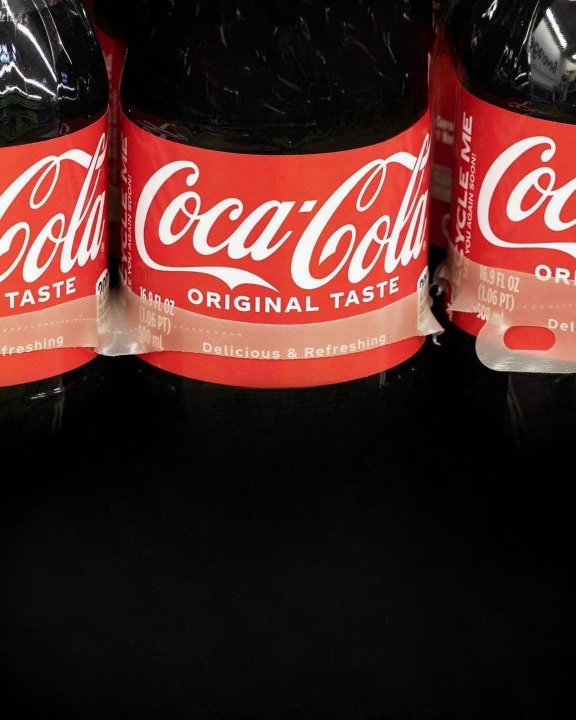
According to these observers, the second letter “C” appears to resemble a smiling face.
A Detail That Caught People’s Attention
At first glance, the Coca-Cola wordmark looks exactly as most people remember it: elegant white lettering set against a bright red background.
But some viewers have noticed that the second capital “C” has a curved shape that resembles a subtle smile.
The upper portion of the letter extends outward before curving back, creating an arc that many people associate with a cheerful grin.
After seeing the comparison, some say it’s difficult to ignore the resemblance whenever they look at the logo.
Why Our Brains Notice Patterns
This type of observation isn’t unusual.
The human brain is naturally wired to recognize familiar shapes and patterns, especially faces and facial expressions. Psychologists refer to this tendency as pareidolia—the phenomenon of seeing meaningful images or faces in everyday objects and random patterns.
It’s the same reason people sometimes notice faces in clouds, tree bark, rock formations, or even the front of a car.
When people recognize a smile-like shape in the Coca-Cola logo, they’re experiencing a common feature of human perception.
The History Behind the Famous Script
The Coca-Cola logo dates back to the late 19th century.
It was designed in the 1880s by Frank Mason Robinson, the company’s bookkeeper and advertising manager. Robinson chose the flowing Spencerian script, a popular style of handwriting widely used in business correspondence during that era.
Its elegant curves, loops, and flourishes reflected the writing style of the time rather than an effort to include hidden visual messages.
Over the decades, the logo has become one of the most recognizable brand identities in the world while preserving its classic appearance.
Was the “Smile” Intentional?
Although the idea has generated plenty of discussion online, there is no historical evidence suggesting the smile-like shape was intentionally included in the original design.
Available historical records and early advertising materials indicate that the script was created as a decorative handwritten wordmark rather than a visual puzzle containing hidden imagery.
The smiling appearance appears to be a modern interpretation rather than a documented design feature.
Why It Feels So Appropriate
Even if the resemblance wasn’t planned, many people think it suits the brand remarkably well.
For decades, Coca-Cola’s advertising has focused on themes such as happiness, friendship, celebration, and sharing special moments. Because of those long-standing associations, the subtle smile noticed by some viewers feels consistent with the company’s image.
Whether intentional or coincidental, the shape seems to reinforce the positive emotions many people already connect with the brand.
Classic Designs Can Inspire New Discoveries
One of the fascinating aspects of iconic logos is that people continue finding new ways to interpret them, even after decades of familiarity.
Sometimes these observations reveal genuine design features, while other times they simply demonstrate how our brains naturally search for recognizable patterns.
Neither interpretation changes the logo itself—but it can change how people experience it.
A Fresh Perspective on a Familiar Logo
The suggestion that the second “C” resembles a smile may never be officially confirmed as part of the original design, and historical evidence doesn’t support it as an intentional feature.
Still, many people enjoy the observation because it offers a fresh way to look at one of the world’s most famous logos.
Whether you immediately see the hidden grin or simply appreciate the elegant script, the discussion highlights how timeless designs can continue to spark curiosity and conversation years after they were first created.
Sometimes, all it takes is looking at something familiar from a slightly different perspective to notice a detail that had been there all along.