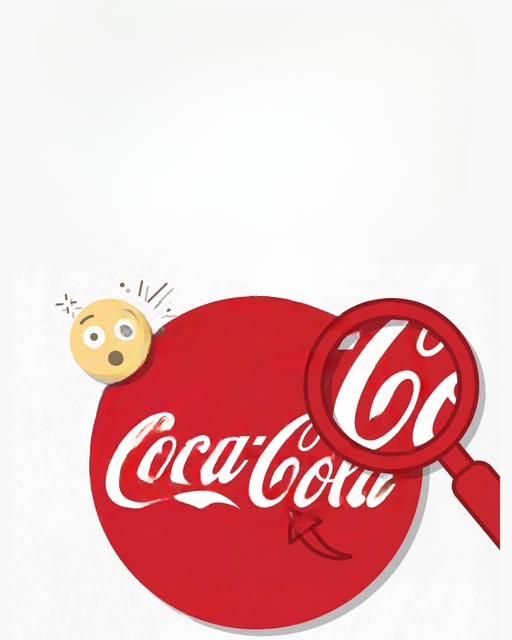
It often begins as a casual observation. Someone looks at the Coca-Cola logo—one of the most recognizable brand marks in the world—and suddenly notices something they had never consciously seen before. The second “C” in “Cola” appears to resemble a soft smile. Once this interpretation is pointed out, it becomes difficult for many people to view the logo the same way again. What was once simply stylized lettering now seems to carry a subtle emotional expression, as if the brand itself is quietly smiling back.
This experience raises an interesting question: is the smile actually part of the design, or is it something created by the human mind after repeated exposure?
To understand this, it helps to look at the origins of the Coca-Cola script. The logo was developed in the late 19th century, around the 1880s, by Frank Mason Robinson, who worked as a bookkeeper for the company’s founder, John Stith Pemberton. Robinson is credited with choosing the name “Coca-Cola” and designing its distinctive flowing script. The lettering style he selected was based on Spencerian script, a popular form of cursive handwriting at the time, known for its elegant, decorative curves and smooth rhythm.
The intention behind the design was not to embed hidden imagery or emotional symbolism. Instead, the goal was aesthetic appeal. Spencerian script was widely used in business correspondence during that era, and it represented refinement, professionalism, and clarity. The Coca-Cola logo was designed to look attractive and distinctive on packaging and advertising materials, not to communicate facial expressions or emotional cues.
There is no documented evidence from the company’s early design records suggesting that the logo was meant to resemble a smile or any other hidden visual element. From a historical design perspective, it is simply stylized lettering shaped by the artistic trends of its time.
However, despite this factual background, many people today perceive something different. The curved flow of the second “C” in “Cola,” combined with the smooth continuity of the script, can resemble the upward arc of a smiling mouth. Once this idea is introduced, the mind often begins to reinforce it automatically.
This phenomenon is not unique to the Coca-Cola logo. Human perception is naturally pattern-seeking. The brain is constantly trying to organize visual information into familiar forms. This tendency is so strong that people often see faces in inanimate objects, a phenomenon known as pareidolia. It explains why shapes in clouds can look like animals, or why random arrangements of objects can resemble human expressions.
In the case of the Coca-Cola logo, several psychological factors work together to strengthen the “smile” interpretation. First, the flowing cursive style creates continuous curves that resemble organic motion rather than rigid structure. Curves are often associated with friendliness and comfort, while sharp angles tend to feel more aggressive or mechanical. This alone can subtly influence emotional interpretation.
Second, the logo has been reinforced through decades of advertising associated with positive emotions. Coca-Cola marketing has long focused on themes such as happiness, sharing, celebration, and togetherness. Over time, repeated exposure to these emotional contexts can influence how people perceive even neutral visual elements. The brain begins to associate the logo not just with a beverage, but with feelings of comfort and enjoyment.
When these emotional associations combine with naturally curved typography, the result is a perceptual shift. What was originally designed as decorative lettering can begin to feel expressive, almost like it carries personality.
Another important factor is familiarity. The more often people see a symbol, the more meaning their brain tries to assign to it. This is known as cognitive reinforcement. With repeated exposure, the mind becomes more sensitive to subtle patterns, even if those patterns were never intentionally designed. In this way, meaning is not only created by designers, but also constructed over time by viewers.
It is also worth noting that branding in general often evolves beyond its original intent. While the Coca-Cola logo was not designed to include a hidden smile, modern audiences interpret it through a cultural lens shaped by advertising, media, and personal experience. Over generations, symbols accumulate meaning far beyond their original design specifications.
In this sense, the “smile” is not a feature embedded in ink or typography. It is a feature embedded in perception.
From a design perspective, this illustrates an important principle: strong branding is not only about visual clarity, but also about emotional resonance. Even when no hidden message is intended, a well-designed logo can still evoke feelings through shape, flow, and cultural context.
The Coca-Cola logo remains largely unchanged for over a century, yet interpretations of it continue to evolve. What started as elegant script has become one of the most studied examples of visual branding in the world. Its perceived “smile” demonstrates how human psychology interacts with design in unpredictable ways.
Ultimately, whether or not the smile is real in a literal sense becomes less important than why people see it. It reflects how the brain interprets familiar symbols through emotion, memory, and cultural influence. The logo itself has never changed, but the way people experience it certainly has.
In the end, the so-called smile is not drawn in ink—it is drawn in the mind.